It is using Dart's built-in Generics
dependencies:
  responsive_value: ^0.0.2
import 'package:responsive_value/responsive_value.dart';
///This will update the text size based on a screen size.
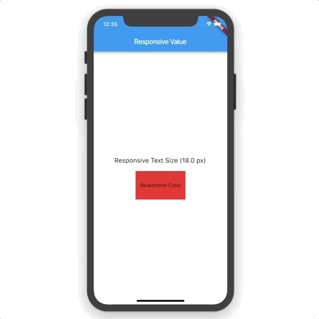
var textSize = Responsive<double>(16, sm: 14, mg: 18, lg: 34).getValue(context);
///This will change the color to RED on a small screen devices.
var color = Responsive<Color>(Colors.black, sm: Colors.red).getValue(context);
Text(
'My Text Size ($textSize px)',
style: TextStyle(fontSize: textSize),
)
Container(
width: 100,
height: 100,
color: color,
)Which will update the value based on screen size from MediaQuery. You can make any valid dart type responsive, Color, Widget, double, etc...
The following example demonstrates how to dynamically wrap children into a Row or Column based on screen size.
var flexDirection = Responsive<Axis>(Axis.vertical, lg: Axis.horizontal).getValue(context);
Flex(
  direction: flexDirection,
  children: <Widget>[
    Text('Item 1'),
    Text('Item 2'),
    Text('Item 3'),
    Text('Item 4'),
  ],
),
By default the breakpints have the following values: sm: (Small) Screen width <= 320 md: (Medium) Screen width 321 <= width <= 767 lg: (Large) Screen width >= 768
You can set custom breakpints by calling setResponsiveBreakpoints
import 'package:responsive_value/responsive_value.dart';

setResponsiveBreakpoints(sm: 200, md: 500, lg: 1000);