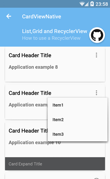
In this page you can find info about:
PAY ATTENTION: to use this feature you have to use the library-recyclerview. for more info.
Creating a CardRecyclerView is pretty simple.
First, you need an XML layout that will display the CardRecyclerView.
    <it.gmariotti.cardslib.library.recyclerview.view.CardRecyclerView
        android:layout_width="match_parent"
        android:layout_height="match_parent"
        card:list_card_layout_resourceID="@layout/native_recyclerview_card_layout"
        android:id="@+id/carddemo_recyclerview"/>
Then create an Array of Cards:
       ArrayList<Card> cards = new ArrayList<Card>();

      //Create a Card
      Card card = new Card(getContext());

      //Create a CardHeader
      CardHeader header = new CardHeader(getContext());
      ....
      //Add Header to card
      card.addCardHeader(header);

      cards.add(card);
Last create a CardArrayAdapter, get a reference to the CardListView from your code and set your adapter.
        CardArrayRecyclerViewAdapter mCardArrayAdapter = new CardArrayRecyclerViewAdapter(getActivity(), cards);

        //Staggered grid view
        CardRecyclerView mRecyclerView = (CardRecyclerView) getActivity().findViewById(R.id.carddemo_recyclerview);
        mRecyclerView.setHasFixedSize(false);
        mRecyclerView.setLayoutManager(new LinearLayoutManager(getActivity()));

        //Set the empty view
        if (mRecyclerView != null) {
            mRecyclerView.setAdapter(mCardArrayAdapter);
        }
This CardRecyclerView uses for each row the row-list layout:
- for the
CardViewNative:res/layout/native_recyclerview_card_layout. - for the
CardView:res/layout/list_card_layout.
Card Library provides 2 built-in row-list layouts.
For the CardViewNative:
res/layout/native_recyclerview_card_layout.xml.res/layout/native_recyclerview_card_thumbnail_layout.xml.
For the CardView:
You can customize the layout used for each item in the RecyclerView using the attr: card:list_card_layout_resourceID="@layout/my_layout
    <it.gmariotti.cardslib.library.recyclerview.view.CardRecyclerView
        android:layout_width="match_parent"
        android:layout_height="match_parent"
        android:id="@+id/carddemo_list_gplaycard"
        card:list_card_layout_resourceID="@layout/native_recyclerview_card_thumbnail_layout" />
In your row-list layout you can use your CardViewNative with all its features and its possibilities.
Example native_recyclerview_card_thumbnail_layout.xml:
    <it.gmariotti.cardslib.library.view.CardViewNative
        xmlns:android="http://schemas.android.com/apk/res/android"
        xmlns:card="http://schemas.android.com/apk/res-auto"
        android:id="@+id/list_cardId"
        android:layout_width="match_parent"
        android:layout_height="wrap_content"
        style="@style/native_recyclerview_card.base"
        card:card_layout_resourceID="@layout/native_card_layout"/>
You can build your layout, but need to have:
- a
CardViewNativeorCardViewwith the IDlist_cardId
You can customize some properties with your style and drawable files. The quickest way to start with this would be to copy the specific style or drawable in your project and change them.
For the CardViewNative:
These are the main style properties:
native_recyclerview_card: common style applied to the single card itemnative_recyclerview_card.base: style applied for base layoutnative_recyclerview_card.thumbnail: style applied for thumbnail layout
margins:
    <dimen name="native_recyclerview_card_margin_left">0dp</dimen>
    <dimen name="native_recyclerview_card_margin_right">0dp</dimen>
    <dimen name="native_recyclerview_card_margin_bottom">4dp</dimen>
    <dimen name="native_recyclerview_card_margin_top">4dp</dimen>
For the CardView:
These are the main style properties:
list_card: common style applied to the single card itemlist_card.base: style applied for base layoutlist_card.thumbnail: style applied for thumbnail layout
margins:
    <dimen name="list_card_padding_left">8dp</dimen>
    <dimen name="list_card_padding_right">8dp</dimen>
    <dimen name="list_card_padding_bottom">6dp</dimen>
    <dimen name="list_card_padding_top">2dp</dimen>