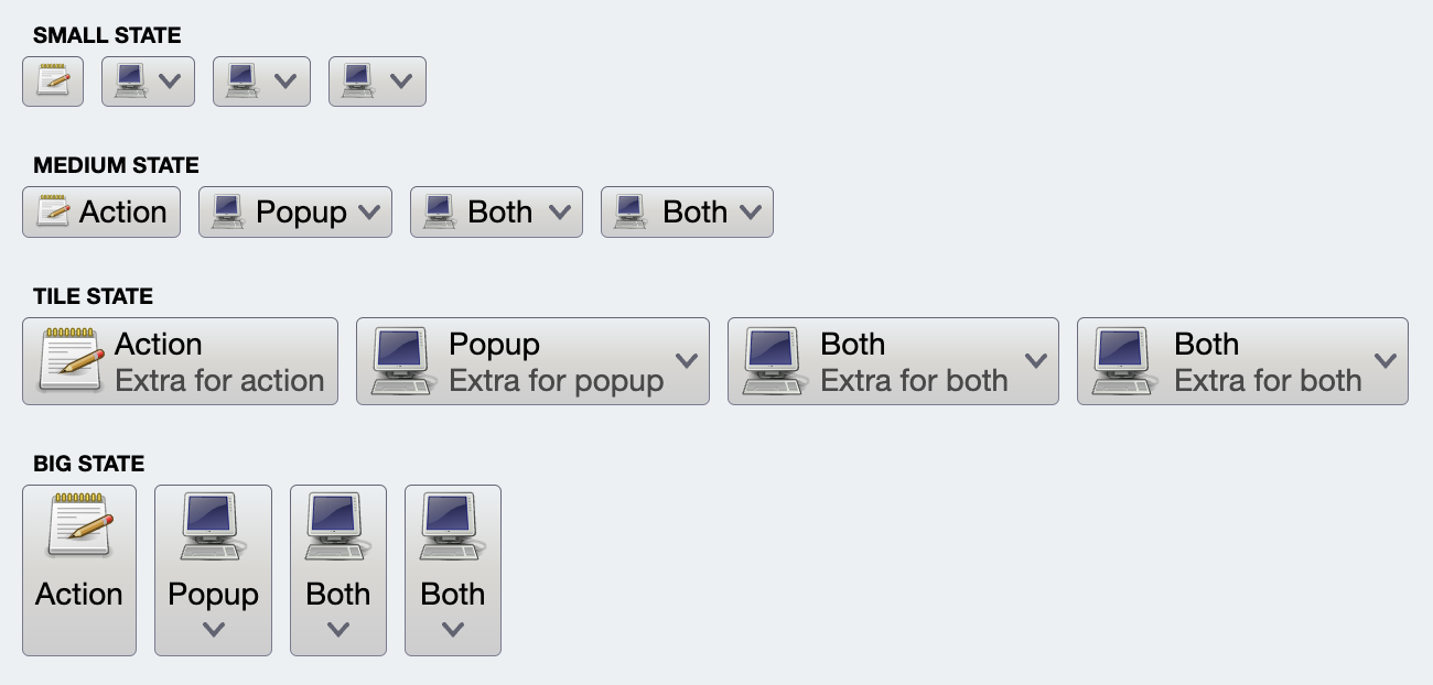
Let's take another look at the example from the command documentation
For the "Action" buttons (first button in each one of the rows), the command that was used to project all four buttons looks like this:
val commandActionOnly =
    Command(
        text = resourceBundle.getString("Action.text"),
        extraText = resourceBundle.getString("Action.textExtra"),
        icon = accessories_text_editor(),
        action = { println("Action activated!") },
        ...
    )
The only difference is the presentation model associated with each one of the projection:
- In the first row (small state), only the small icon is showing.
- In the second row (medium state), the icon is small, and only text is showing.
- In the third row (tile state), the big icon is on the left, and the vertical stack on the right displays the text and the extra text.
- In the fourth row (big state), the button is showing the text (that might go to two lines) and a big icon, stacked vertically.
Here is how the first (small) button is created:
CommandButtonProjection(
    contentModel = commandActionOnly,
    presentationModel = CommandButtonPresentationModel(
      presentationState = CommandButtonPresentationState.Small)
).project()
There are two important parts here - the presentation model and projecting the command onto the screen. Let's talk about these two parts.
In Aurora's terminology, a command (represented by the Command data class) is a content model. It describes the basic elements of a command (such as text and icon), how the user interacts with it, and what happens when that interaction happens.
The presentation model describes how to "convert" (or project) a content model into a composable that can be added to the application UI hierarchy to present the data backed by that content model and react to the user interaction.
In this particular case, we are projecting our command as a button composable - hence the CommandButtonPresentationModel class name. It is a data class and we pass a presentationState attribute to be using the "small" layout:
CommandButtonPresentationModel(
  presentationState = CommandButtonPresentationState.Small)
Going back to our screenshot:
What is different between the four "Action" buttons in each row? The only thing is the presentation state set as the presentationState attribute on the command button presentation model. The rest is identical.
Now let's talk about the projection is.
Projection is the act of "combining" a content model and a presentation model and creating a composable. In our case, Command is our content model and CommandButtonPresentationModel is our presentation model.
The same command object can be projected multiple times on the screen - four in the case of our demo app. And the same presentation model object can be used to project multiple commands in case all of them use the same presentation "instructions".
Taking another look at the combined code:
val commandActionOnly =
    Command(
        text = resourceBundle.getString("Action.text"),
        extraText = resourceBundle.getString("Action.textExtra"),
        icon = accessories_text_editor(),
        action = { println("Action activated!") },
        ...
    )

CommandButtonProjection(
    contentModel = commandActionOnly,
    presentationModel = CommandButtonPresentationModel(
      presentationState = CommandButtonPresentationState.Small)
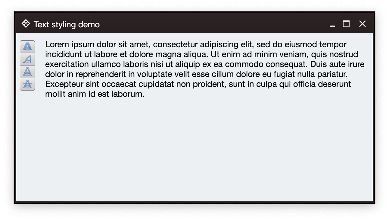
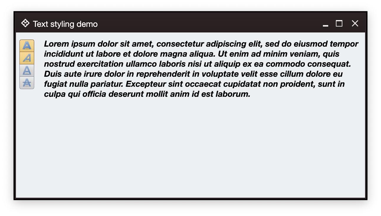
).project()In an earlier example we have four buttons to change content styling (bold, italic, underline and strikethrough) of a text area:
Let's take a look at how the "bold" styling is done. First, we create the command (which is the content model):
// Bold style command
val commandBold = Command(
    text = "Bold",
    icon = format_text_bold(),
    isActionToggle = true,
    isActionToggleSelected = bold,
    onTriggerActionToggleSelectedChange = { bold = it }
)
along with the backing state variable and its derived text style and content:
var bold by remember { mutableStateOf(false) }
...

val spanStyle by derivedStateOf {
    SpanStyle(
        fontWeight = if (bold) FontWeight.Bold else FontWeight.Normal,
        ...
    )
}

val textFieldValue by derivedStateOf {
    TextFieldValue(
        annotatedString = AnnotatedString(
            text = text,
            spanStyle = spanStyle
        )
    )
}
Compose's remember { mutableStateOf(...) } is the source of truth for the presence of the bold style in our text block. Our command sets its isActionToggleSelected to the current value of the bold state variable, and also updates that state in the onTriggerActionToggleSelectedChange lambda.
Whenever the bold state variable changes, that change "flows" into the spanStyle and textFieldValue (with how derivedStateOf works in Compose), and as that text field value is used for the content of our text composable, the entire text area gets recomposed to reflect the new bold or unbold styling.
This is the whole purpose of existence for content model (command), presentation model (command button presentation model) and projection (command button projection).
Content model encapsulates the "business logic", if you will, of one piece of the application model realm. In our case, it is a piece of model realm that deals with applying bold styling on a text somewhere in the application UI. That piece of model realm is the one that should be tracking whether that bold styling is on or off (the isActionToggleSelected attribute).
Compose then takes care of updating all the projections based on the changes in the content model - be it a single projection of each styling command in our last example, or more than one projection of the same content model as can be seen in the ribbon.
It's worth noting that a particular command may not be projected in the current screen at all. In this case you would still want to continue updating the content model (which is that command) based on the specific application logic - as you would do with any other piece of your model realm that you keep in sync with the latest local or remote data changes.
Continue to the command button presentation models.


