AuroraBoxWithHighlights is a special container provided by Aurora that does not use projections. The primary purpose of this container is to provide a way to apply selection and rollover highlights on complex content that behaves as a single unit.
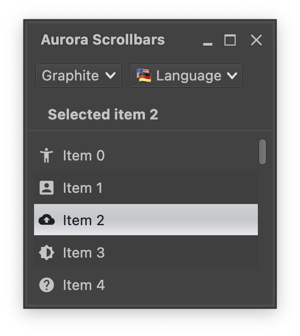
Every row in this vertical list is an AuroraBoxWithHighlights. Selection and rollover state facets are applied on the label - compare the light-on-dark visuals of unselected rows vs the dark-on-light visuals of the selected one.
Let's take a look at the moving parts. First we start with managing state, one for the lazy list and one for the selected index:
val lazyListState = rememberLazyListState()
val stateSelection = mutableStateOf(-1)
Next we get the MessageFormat object for fetching the locale-aware texts of each row:
val commandMf = MessageFormat(resourceBundle.getString("Group.entrySimple"))And now the scrollable content itself that uses AuroraBoxWithHighlights to wrap the content of each row:
Box(modifier = Modifier.fillMaxSize().padding(6.dp)) {
  val itemsList = (0 until itemCount).toList()
  val backgroundColorScheme = AuroraSkin.colors.getBackgroundColorScheme(
      decorationAreaType = AuroraSkin.decorationAreaType
  )
  val backgroundEvenRows = backgroundColorScheme.backgroundFillColor
  val backgroundOddRows = backgroundColorScheme.accentedBackgroundFillColor
  LazyColumn(
    modifier = Modifier.fillMaxSize()
        .padding(end = ScrollBarSizingConstants.DefaultScrollBarThickness),
    state = lazyListState
  ) {
    itemsIndexed(itemsList) { index, item ->
      AuroraBoxWithHighlights(
        modifier = Modifier.fillMaxWidth().height(32.dp)
            .background(if (index % 2 == 0) backgroundEvenRows else backgroundOddRows),
        selected = (stateSelection.value == item),
        onClick = { stateSelection.value = item },
        sides = Sides.ClosedRectangle,
        content = {
          LabelProjection(
            contentModel = LabelContentModel(
              text = commandMf.format(arrayOf<Any>(index)),
              icon = icons[item % icons.size]
            ),
            presentationModel = LabelPresentationModel(
              inheritStateFromParent = true,
              iconEnabledFilterStrategy = IconFilterStrategy.ThemedFollowText,
              horizontalGapScaleFactor = 2.0f
            )
          ).project()
        }
      )
    }
  }
  AuroraVerticalScrollbar(
    modifier = Modifier.align(Alignment.CenterEnd).fillMaxHeight(),
    adapter = rememberScrollbarAdapter(scrollState = lazyListState)
  )
}
Let's take a closer look at all the parts:
- The top-level container is a
Boxthat has two child composables,LazyColumnfor the scrollable content andAuroraVerticalScrollbarfor the scrollbar. Note theModifier.padding(end)on theLazyColumnthat "reserves" the space for the vertical scroll bar, and the usage of ourlazyListStateto keep the vertical scroll bar in sync with the current scroll state. - Each item in the list is a wrapped
LabelProjection. Note theinheritStateFromParent=trueattribute on the presentation model that instructs Aurora to propagate the state (selected and rollover facets) from the wrapper down to the label projection, and the usage ofIconFilterStrategy.ThemedFollowTextto keep the icon painted in the same color as the label text. - The wrapper around each label projection is our
AuroraBoxWithHighlights. Note how it syncs itsselectedattribute with thestateSelectionstate variable, and then updates that state variable inonClicklambda.
Continue to context menu.