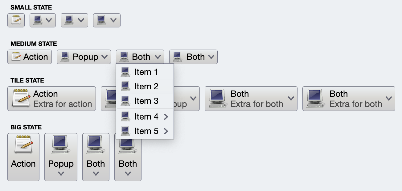
Command menu is a multi-tiered collection of commands. Any command in any tier can have associated secondary content that is, in turn, its own command menu - essentially creating traditional cascading menus. At any tier, a command menu can have a vertically scrollable command panel - seen in the following screenshot as a 5-column grid of large buttons.
CommandMenuContentModel is the content model for command menus. If a menu content model has more than one command group, the groups are visually delineated with horizontal separator when they are projected and displayed on the screen.
The highlightedCommand attribute can be used to visually mark one command in the overall menu to be highlighted.
The panelContentModel is an optional attribute. When it's not null, it points to the content model of the command button panel shown above the grouped menu commands.
CommandPopupMenuPresentationModel is the presentation model for command popup menus.
The panelPresentationModel attribute can be used to provide the presentation model for the optional leading command panel.
The maxVisibleMenuCommands controls the maximum number of regular commands visible on the screen before vertical scrolling kicks in. In the screenshot below the combobox popup (which is implemented as a command menu) is configured to display at most 8 items:

The menuPresentationState attribute determines the visual presentation of the commands in the projected menu content.
Let's see the code behind this popup menu:
First we create the same command panel content model as in the previous example:
fun getQuickStylesContentModel(resourceBundle: State<ResourceBundle>): CommandPanelContentModel {
  val icons = arrayOf(
    accessibility_new_24px(),
    account_box_24px(),
    backup_24px(),
    brightness_medium_24px(),
    help_24px(),
    info_24px(),
    keyboard_capslock_24px(),
    location_on_24px(),
    perm_device_information_24px(),
    storage_24px(),
    visibility_24px(),
    waves_24px()
  )

  val groupMf = MessageFormat(resourceBundle.getString("Group.title"))
  val commandMf = MessageFormat(resourceBundle.getString("Group.entry"))

  val commandGroups: MutableList<CommandGroup> = arrayListOf()
  for (groupIndex in 1..4) {
    val commands: MutableList<Command> = arrayListOf()
    for (i in 1..15) {
      val command = Command(
        text = commandMf.format(arrayOf<Any>(i, 15)),
        icon = icons[i % icons.size],
        action = { println("Invoked action on $i") }
      )
      commands.add(command)
    }
    commandGroups.add(CommandGroup(groupMf.format(arrayOf<Any>(groupIndex)), commands))
  }
  return CommandPanelContentModel(commandGroups = commandGroups,
    commandActionPreview = object : CommandActionPreview {
      override fun onCommandPreviewActivated(command: Command) {
        println("Action preview activated for ${command.text}!")
      }

      override fun onCommandPreviewCanceled(command: Command) {
        println("Action preview canceled for ${command.text}!")
      }
      })
}
Then we create a CommandMenuContentModel from that command panel content model and three additional command (split into two command groups) and set it as secondaryContentModel on our main Command:
val commandPasteTextOnly = Command(
  text = resourceBundle.getString("Edit.paste.textOnlyText"),
  action = { println("Paste text only") },
  isActionToggle = true,
  isActionToggleSelected = togglePasteText,
  onTriggerActionToggleSelectedChange = {
      println("Selected toggle paste text? $it")
      togglePasteText = it
  }
)

val commandPaste =
  Command(
    text = resourceBundle.getString("Edit.paste.text"),
    icon = content_paste_black_24dp(),
    action = { println("Paste!") },
    secondaryContentModel = CommandMenuContentModel(
      group = CommandGroup(
        commands = listOf(
            Command(
              text = resourceBundle.getString("Edit.paste.keepFormattingText"),
              action = { println("Paste with keep formatting") }),
            Command(
              text = resourceBundle.getString("Edit.paste.mergeFormattingText"),
              action = { println("Paste with merge formatting") }),
            commandPasteTextOnly,
          )
        ),
        panelContentModel = getQuickStylesContentModel(resourceBundle)
      )
    )
Now we come to the interesting part. Our commandPaste is going to be a part of the CommandGroup content model used to project the command button strip. How do we configure the command popup menu presentation model for one individual command in that command button strip? Since application design might call for slightly different presentation options for multiple split / popup buttons in the same command button strip, there is no attribute that CommandStripPresentationModel exposes to configure the presentation model for popup menus of all commands.
In Aurora, the answer to this is overlays. First, here is the full signature of the CommandButtonStripProjection class:
class CommandButtonStripProjection(
    val contentModel: CommandGroup,
    val presentationModel: CommandStripPresentationModel,
    val overlays: Map<Command, CommandButtonPresentationModel.Overlay>? = null
)
Note how, in addition to the content and the presentation models, we also have the optional overlays. What is an overlay? An overlay is a "mirror" data class defined in the CommandButtonPresentationModel data class, and it has the same exact attributes.
What do we want to express in our particular case?
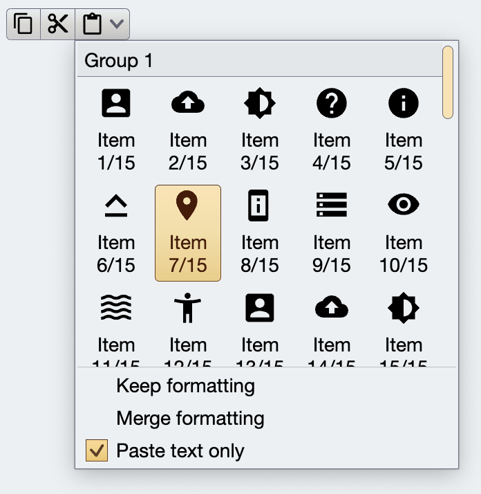
We want to say that for one particular command in the content model of the whole command button strip, we want to use a specific CommandPopupMenuPresentationModel (the one with at most five columns and three rows of content, and specific layout of each command button in it). Here is how the full projection definition of this command button strip looks like:
CommandButtonStripProjection(
  contentModel = CommandGroup(
    commands = listOf(
      commandCopy,
      commandCut,
      commandPaste
    )
  ),
  presentationModel = CommandStripPresentationModel(
    orientation = StripOrientation.Horizontal,
    horizontalGapScaleFactor = horizontalGapScaleFactor,
    iconEnabledFilterStrategy = IconFilterStrategy.ThemedFollowText,
    iconDisabledFilterStrategy = IconFilterStrategy.ThemedFollowText,
    iconActiveFilterStrategy = IconFilterStrategy.ThemedFollowText
  ),
  overlays = mapOf(
    commandPasteTextOnly to CommandButtonPresentationModel.Overlay(
      toDismissPopupsOnActivation = false
    ),
    commandPaste to CommandButtonPresentationModel.Overlay(
      popupMenuPresentationModel = CommandPopupMenuPresentationModel(
        panelPresentationModel = CommandPopupMenuPanelPresentationModel(
          layoutSpec = MenuPopupPanelLayoutSpec(columnCount = 5, visibleRowCount = 3),
          contentPadding = PaddingValues(0.dp),
          showGroupLabels = true,
          commandPresentationState = CommandButtonPresentationState.BigFitToIcon,
          commandIconDimension = DpSize(24.dp, 24.dp),
          iconActiveFilterStrategy = IconFilterStrategy.ThemedFollowText,
          iconEnabledFilterStrategy = IconFilterStrategy.ThemedFollowText
        )
      )
    )
  )
).project()
What do we have here?
- The content model for the whole button strip is the
CommandGroupwith three commands. - The presentation model for the whole button strip is a
CommandStripPresentationModelthat configures the visuals of the icons and overall horizontal strip orientation. - The first overlay entry we have is for
commandPasteTextOnlywhich is the "Paste text only" menu entry at the very bottom of the menu popup. It is configured with anOverlaythat has itstoDismissPopupsOnActivationset tofalse. This instructs Aurora to not dismiss this whole popup when that menu entry is toggled. - The second overlay entry we have is for the
commandPastewhich is the top-level command for the third button in our command button strip (the one with this complex popup menu). - Here, our
Overlayhas apopupMenuPresentationModelthat configures its innerpanelPresentationModelwith our specific visuals (icon size, presentation state, icon filter strategy, column and row count, showing group labels, etc).
Continue to the model and projection overview.