This page contains all detailed info and tips about progress feature of PowerfulImageView.
Most applications use images loaded from the internet. There are a lot of great libraries to handle these cases, like Picasso or Glide. These libraries allows you to show placeholders in your imageViews while downloading/processing the image, too.
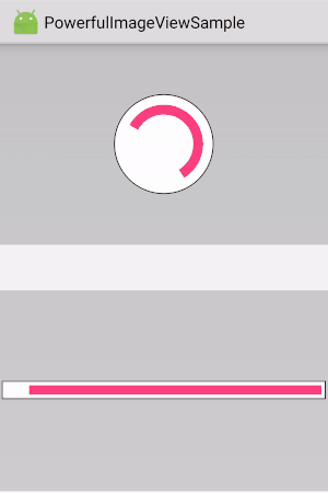
While this helps a lot, the placeholder doesn't provide any feedback or information to the user. So I created this library to show a progress indicator directly into the Image View, imitating the Android material circular progress bar, to show the current download (or an indeterminate progress bar when the image is downloaded, but processing).
This is flexible enough to let you use the progress in other ways, like tracking time passing, current achievements or whatever you want.
Changing options will automatically invalidate the progress, so that you don't need to do it manually. It work from both the UI and background threads.
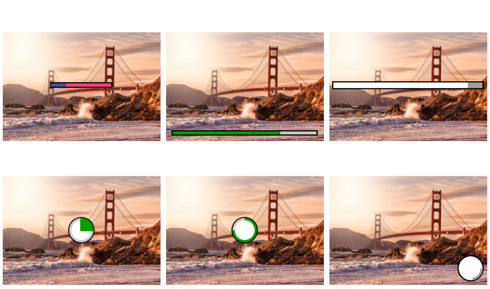
The progress will be displayed above the image, regardless of whatever shape is selected (if any).
Animations automatically stop when power saving mode is enabled. This is by design in Android with ObjectAnimator, used for animations in this library, to reduce battery consumption.
The progress indicator automatically supports rtl (unless disabled by its flag). This means that progress gravity follows the start/end behaviour, and that the progress is reversed with rtl languages.
Blurring the image is detected as a change, so the progress will be removed if pivProgressRemovedOnChange is true.
Performance
No drawables or nested Views are used for the progress. Calculations are done to draw arcs or rectangles in order to imitate material design progress bar.
Reliability
Methods to avoid and catch OutOfMemoryExceptions are in place.
Customizability
All aspects can be customized. From the animation speed, to size, padding and color of progress, progress shadow and progress shadow border.
Ease of use
Basic integration needs only pivProgressMode to the xml element.
| Name | Type | Default | Description |
|---|---|---|---|
| pivProgressGravity | enum | center | Set the gravity of the indicator. It will follow the rtl layout (on api 17+), if not disabled. Values are: center, start, end, top, top_start, top_end, bottom, bottom_start, bottom_end |
| pivProgressMode | enum | disabled | Progress mode of the indicator. Values are: disabled, circular, horizontal |
| pivProgressIndeterminate | boolean | true | Set whether the view should show an indeterminate progress indicator. |
| pivProgressValue | float | 0 | Percentage value of the progress indicator, used by determinate progress. If the percentage is higher than 100, it is treated as (value % 100). If the percentage is lower than 0, it is treated as 0. If the progress is indeterminate it's ignored. |
| pivProgressSize | dimension-fraction | 40% | Size of the progress indicator, in a specific dimension or in percentage (20dp or 30%). If the specific dimension is less than 0, it is ignored. If the percentage is higher than 100, it is treated as (value % 100). |
| pivProgressPadding | dimension | 2dp | Set the padding of the progress indicator. |
| pivProgressBorderWidth | dimension-fraction | 10% | Width of the progress indicator border, in a specific dimension or in percentage (20dp or 30%). If the specific dimension is less than 0, it is ignored. If the percentage is higher than 100, it is treated as (value % 100) |
| pivProgressShadowBorderWidth | dimension | 1dp | Set the width of the shadow border. |
| pivProgressShadowPadding | dimension-fraction | 0% | Set the padding of the progress indicator relative to its shadow., in a specific dimension or in percentage (20dp or 30%). If the specific dimension is less than 0, it is ignored. If the percentage is higher than 100, it is treated as (value % 100) |
| pivProgressShadowEnabled | boolean | true | Set whether to show a progress shadow, used by drawers. If true, the shadow is drawn. |
| pivProgressDeterminateAnimationEnabled | boolean | true | Set whether the progress should update with an animation. If the progress is indeterminate it's ignored. If true it updates its progress with an animation, otherwise it will update instantly |
| pivProgressAnimationDuration | integer | 100 | Default progress animation duration |
| pivProgressRtlDisabled | boolean | language-based | Set whether the view should use right to left layout. If true, start will always be treated as left and end as right. If false, on api 17+, gravity will be treated accordingly to rtl rules. |
| pivProgressDrawWedge | boolean | false | Set whether to show a wedge or a circle, used by circular progress. If the progress is not circular it's ignored. If true, a wedge is drawn, otherwise a circle will be drawn. |
| pivProgressReversed | boolean | false | Set whether the progress should be reversed. |
| pivProgressRemovedOnChange | boolean | true | Set whether the progress should be reset when the drawable changes. |
| pivProgressFrontColor | color | #00A000 | Set the front color of the indicator. If the drawer is indeterminate it's ignored. |
| pivProgressBackColor | color | #CCCCCC | Set the back color of the indicator. If the drawer is indeterminate it's ignored. |
| pivProgressIndeterminateColor | color | #A0A0A0 | Set the indeterminate color of the progress indicator. |
| pivProgressShadowColor | color | #FFFFFF | Set the shadow color of the indicator. |
| pivProgressShadowBorderColor | color | #000000 | Set the color of the progress indicator shadow border. |
Java methods
All options are available via progressImageView.getProgressOptions().set...
Convenience methods are provided for:
| Name | Param | Description |
|---|---|---|
| setProgressMode | PivProgressMode | Changes the progress mode of the indicator (e.g. passing from determinate to indeterminate). It also starts animation of indeterminate progress indicator. |
| setProgressValue | float | Set the progress of the current indicator. If the drawer is indeterminate, it will change its state and make it determinate. |
| setProgressIndeterminate | boolean | Whether the progress indicator is indeterminate or not |
| getProgressMode | Get the current progress mode selected. |
Options allow great customizations, but they may be overwhelming. Also, you should have a consistent UI. To do so, you should define a custom style, configuring all the aspects of the PowerfulImageView progress, and then use your own style anywhere you need. This is good for theming, too!
You just need to add your configuration in your styles.xml file like this:
    <style name="MyPivStyle">
        <item name="pivProgressIndeterminateColor">@color/colorAccent</item>
        <item name="pivProgressFrontColor">@color/colorPrimary</item>
        <item name="pivProgressBackColor">@color/colorAccent</item>
        <item name="pivProgressIndeterminate">false</item>
        <item name="pivProgressMode">circular</item>
        ...
    </style>
Then apply it like this:
    <com.stefanosiano.powerfullibraries.imageview.PowerfulImageView
        android:id="@+id/piv"
        android:layout_width="match_parent"
        android:layout_height="wrap_content"
        style="@style/MyPivStyle"/>