Mar 07, 2023 - Franky Jr Blondeel
Live version here
colorpal is a little app I developed as part of Module 9 of the Front-Developer Career Path over at scrimba.com. It focuses on using API calls, this time using the ColorAPI. It's an app with a similar purpose as for instance coolors.co, where you can quickly generate a nice matching set of colors, based on some algorithm of choice.
This color generator project was a nice closure to a very interesting chapter of the course. Basically applying what we have seen before. I'll list the topics once more below, you can also find some more detail in my BlogSpace repository.
I'll dive into some more details about this specific project below.
Some basic requirements were given to start this Solo Project. The usage of the color input is something I hadn't seen before, nice to know what cool tools are given by modern browser to allow you to quickly select a color.
So as you can see, the requirements were kind of basic, asking for a simple button to lookup the color, and displaying the hex values of the colors, with a stretch goal of allowing the user to copy them to the clipboard.
The requirements I set for myself though, were a bit more extensive and I list them below. I wanted to basically approach the design principles of coolors.co. Instant reaction by the app, on any change of the input. For these types of apps I'm not a fan of adding extra barriers to users to get results.
- Instant reaction when changing a parameter
- Random result on loading of the app
- Allowing the user to choose the amount of colors they want returned (saw that was one of the capabilities of the ColorAPI)
- Fully responsive, regardless of how many colors are returned
- Pressing spacebar to generate new random result (but also implementing the mobile alternative)
- Strong focus on good working functionality for all screens. Limiting features where necessary.
- Offer other color-spaces to copy too
- Display names of colors
- Focus on UX, small animations, make it nice to look at.
I started the development of the app, just as a small browser app for desktop. Which I kind of regretted in the end. It would've been the perfect candidate again for a mobile-first approach, but hey. I got carried away to as quickly as possible get some first results on the screen. It's not like the fact that this caused me too my trouble in the end, I feel. In fact, I just made sure that the app was as feature rich as possible on desktop, and then actually kind of scaled it down for mobile (like coolors seems to do.)
As usual, I started with hardcoding the HTML, so I could get the CSS about 90% done, before I switched to actual JS to generate the pages.
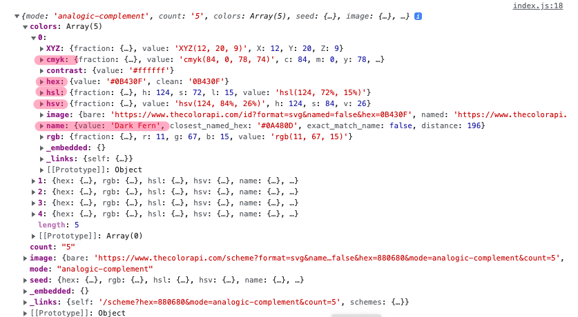
ColorAPI is really straightforward to set up, I think in about 2 hours I had the entire base site setup with the base styling I was after. Also, what was really interesting is that the ColorAPI, by default, gives a lot of Info back in the response! The name, the requested colors in alternative color spaces, etc... Basically, all the data that I was after to give my users a similar experience like Coolors does.
Visualizing everything that is returned, was quite easy.
One interesting issue, is that you cannot predict what color will be returned by the API, and therefore, you cannot know what color the text on screen should have. After some googling, I found this very interesting repository on github that gave me exactly what I was after: auto contrasting colors: onury / invert-color
Using NPM I could very easily import the package and use it in my project! This is also the very first timeI used a 'foreign' package (not really, but you know what I mean). This also meant I had to run an actual build for the first time using Vite, which is the framework I tend to use. Which gave me some problems in the end, I won't go into it too deep, but I was able to solve them.
Using this borrowed package though, I could now very easily return a #FFF or #000 based on the contrast calculation returned by invert-colors. Really handy!
Next up, with all colors loading in correctly and being displayed on the screen correctly, I wanted to improve the UX a little bit. Mainly:
- Some animations while data is loading (what if someone has slow internet?)
- Minimalist approach: Less buttons, less text
- Transitions or things appearing on the screen should be smooth.
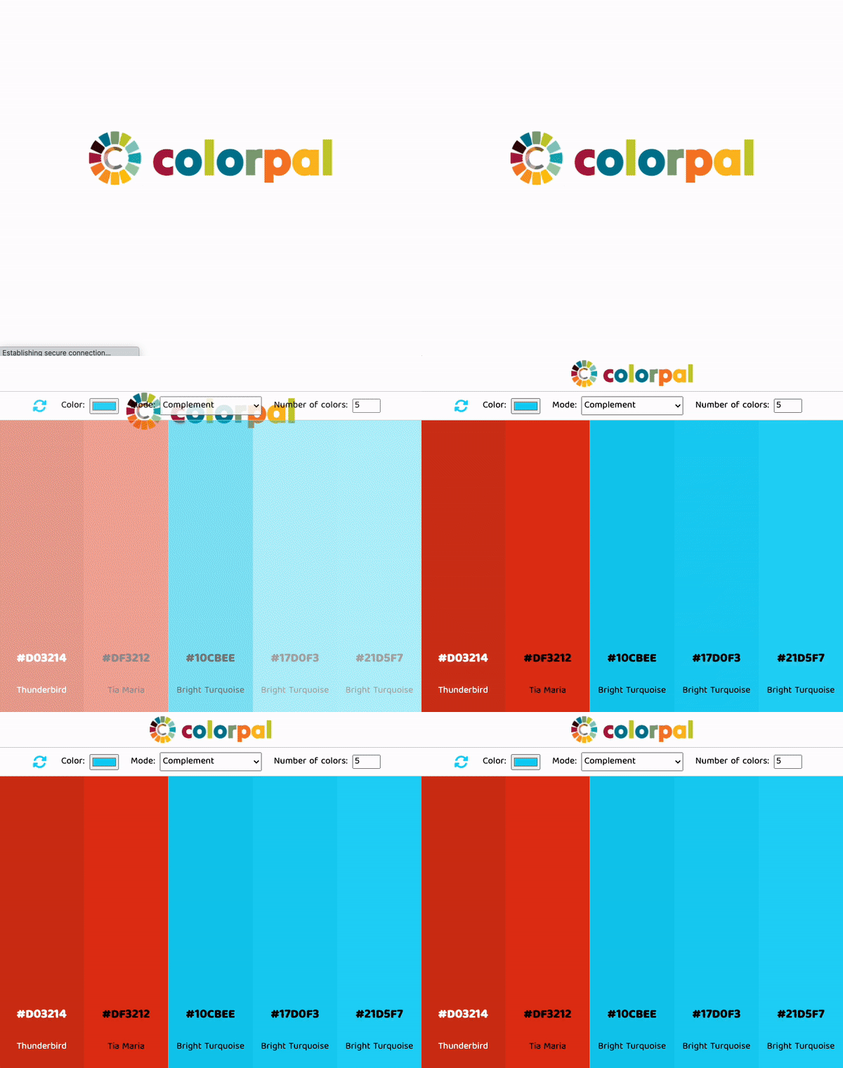
I started with a small logo animation, when users hit the site first, this allows the colors in the background to be loaded already.
Next up, when user loaded in a new palette, I thought it would be nice if the colors came in gradually. So I built a randomizer, which returns a random amount of milliseconds every time you fetch new colors. It just looks a lot better :)
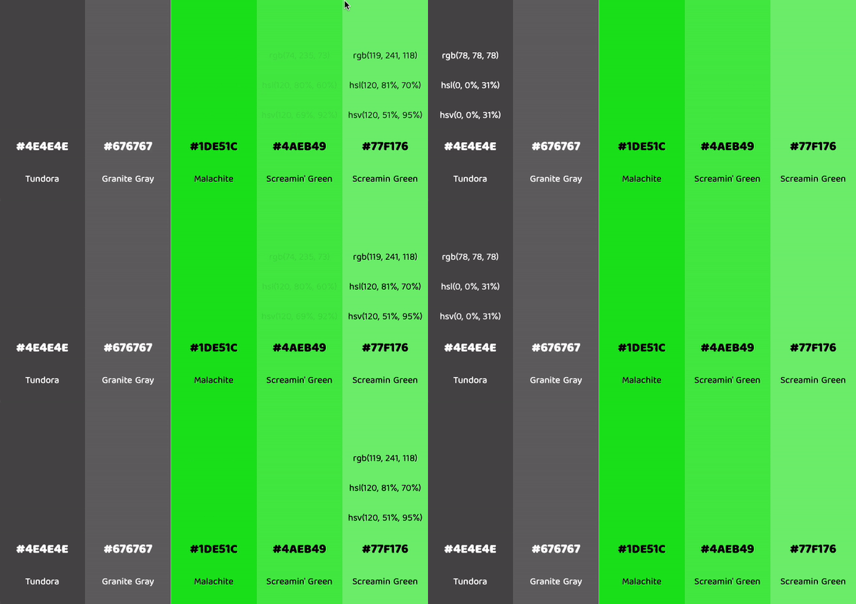
Also, I reduced the amount of data that is initially visible on the screen. Meaning, other color spaces are hidden, unless the user hovers over the relevant color block. Also on the text, I added a small transition just to make it all smoother.
The app came alive, I liked it!
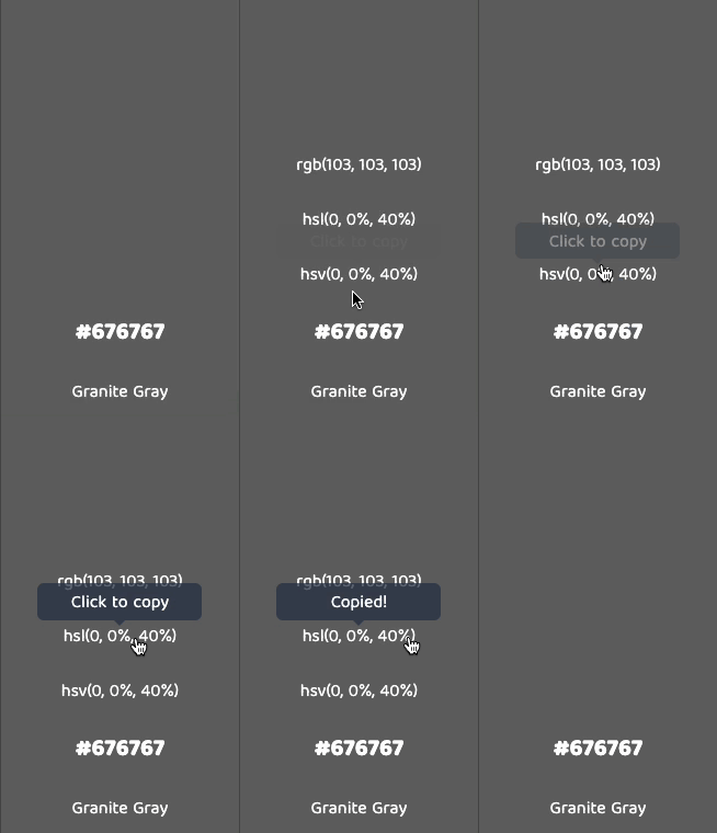
I was able to add the copy paste feature in pretty quickly, because I had added it to a previous app before, the password generator I built a couple of months back. I borrowed the code, adjusted it, made it react to the responsive nature of the app too. Quick win, onto the next.
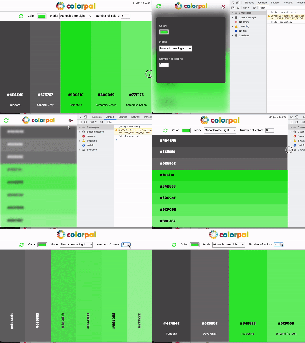
Now that the entire base site seemed to be setup; I went and looked at how I would tackle the mobile experience. Of course, the options would have to be reduced inside some hamburger menu somewhere, but there were additional challenged here.
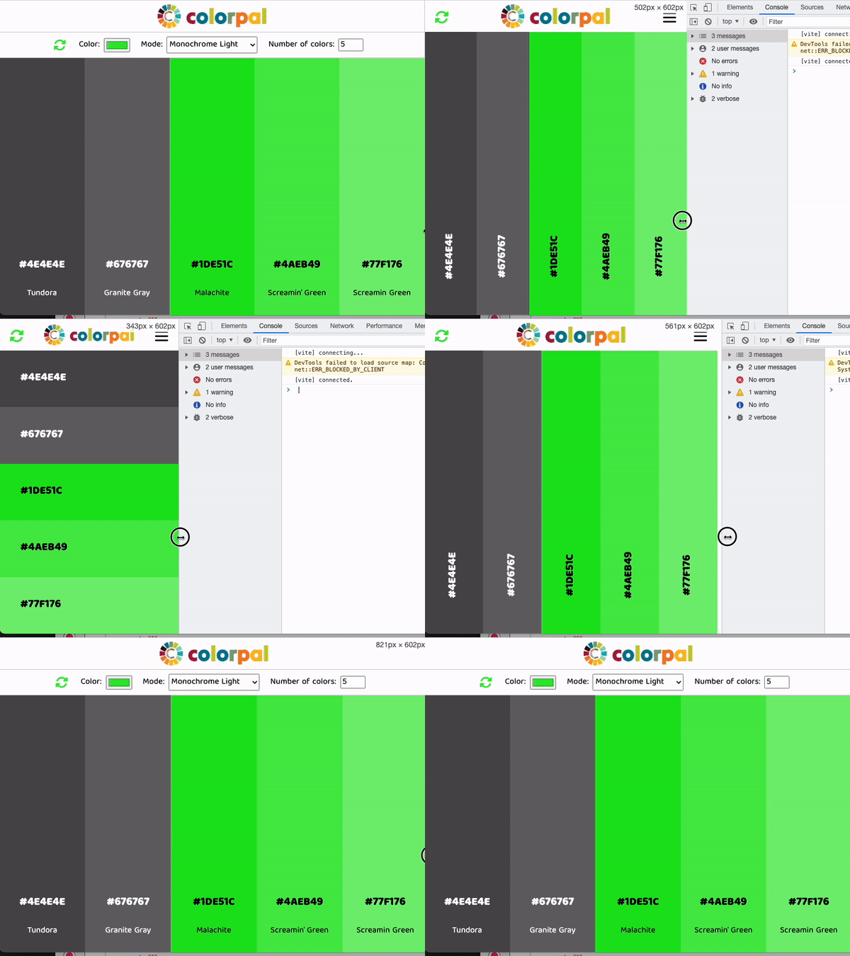
I could (as far as I know at least...) not opt for a standard media query approach here, because I could not predict how many colors the user would have on the screen. The amount of colors on the screen has a direct impact on how readable the text would be inside the bars. Coolors does something similar, when the bars get thin enough, the text flips 90degrees, or even the bars go all from a vertical orientation to a horizontal one.
So I decided to approach it in a same way. Therefore, every time the screen is resized OR every time the user changes the amount of colors they want returned, I make a calculation where I take the total width of the screen, and divide it by the number of colors requested. The returned value lets me know how wide the bars would be. And therefore, I could then decide what I do with the text, and the bars themselves.
Implementing this then brought with it a whole set of new problems 😂 I will not bore you with all the details, most important message is that everything got ironed out in the end.
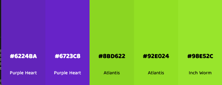
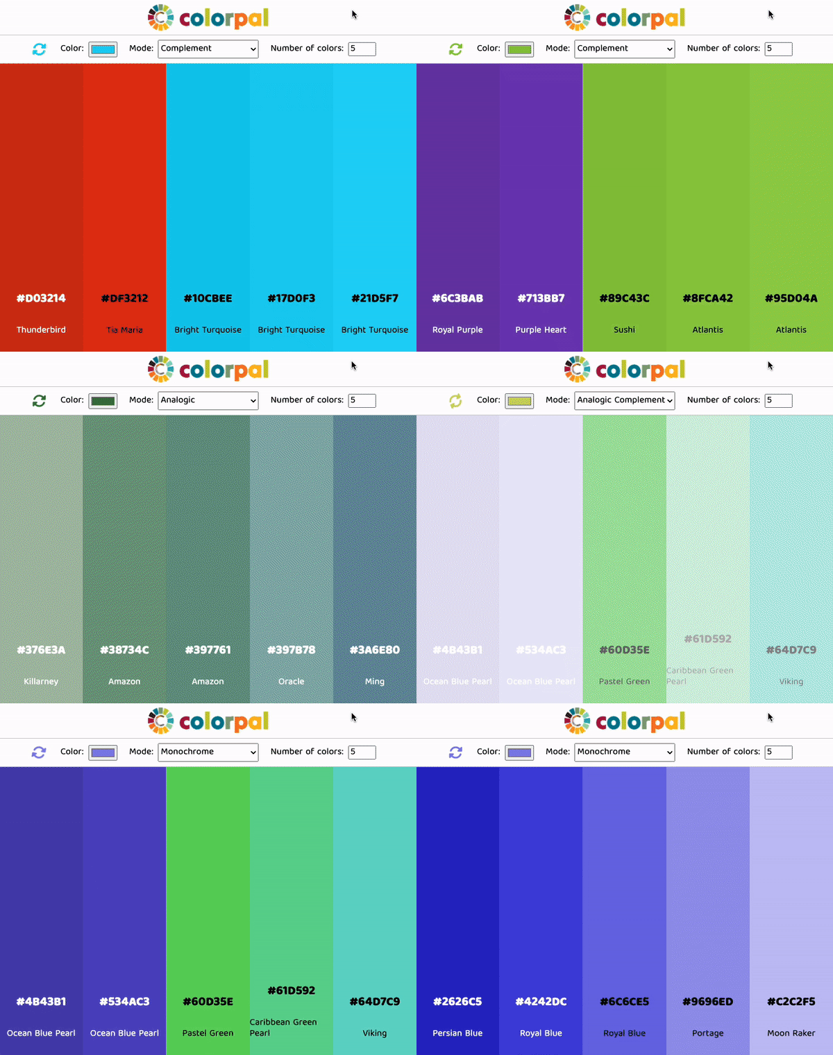
Below are a couple of examples of the result. Quite proud of this one. Cracking tougher problems is always interesting and you learn a lot along the way.


