flickrGal is a fully responsive, easy to use gallery utilising the flickr api. It pulls specified image collections from a flickr account.
The primary goal of flickrGal is to provide a super fast flickr gallery that can be painlessly integrated and configured.
It's perfect for Photographers, Artists, or anyone wanting to showcase their work on a website with minimal hassle.
Written purely in javascript, with no external dependencies.
Note - remember not to use your api key for anything important in production, I haven't provided any method for storing api keys here. That bit's up to you.
To get going with flickrGal, simply add the flickrGal div somewhere on your page. You'll need to set data-apikey and data-userid to the values obtained by requesting your flickr api key. See flickr's instructions for info on how to request that.
<div id="flickrgal" data-collections='["all"]' data-apikey='yourApiKey' data-userid='yourUserId'></div>Use the collections data attribute to specify which collections you want to load. all will load every photoset from every collection.
Collections can also be specified individually like so:
<div id="flickrgal" data-collections='["My Collection", "Another Collection"]' data-apikey='yourApiKey' data-userid='yourUserId'></div>The gallery will expand to the full width of whatever container it's inside, and behave according to the defined grid and breakpoints (more about those in configuration).
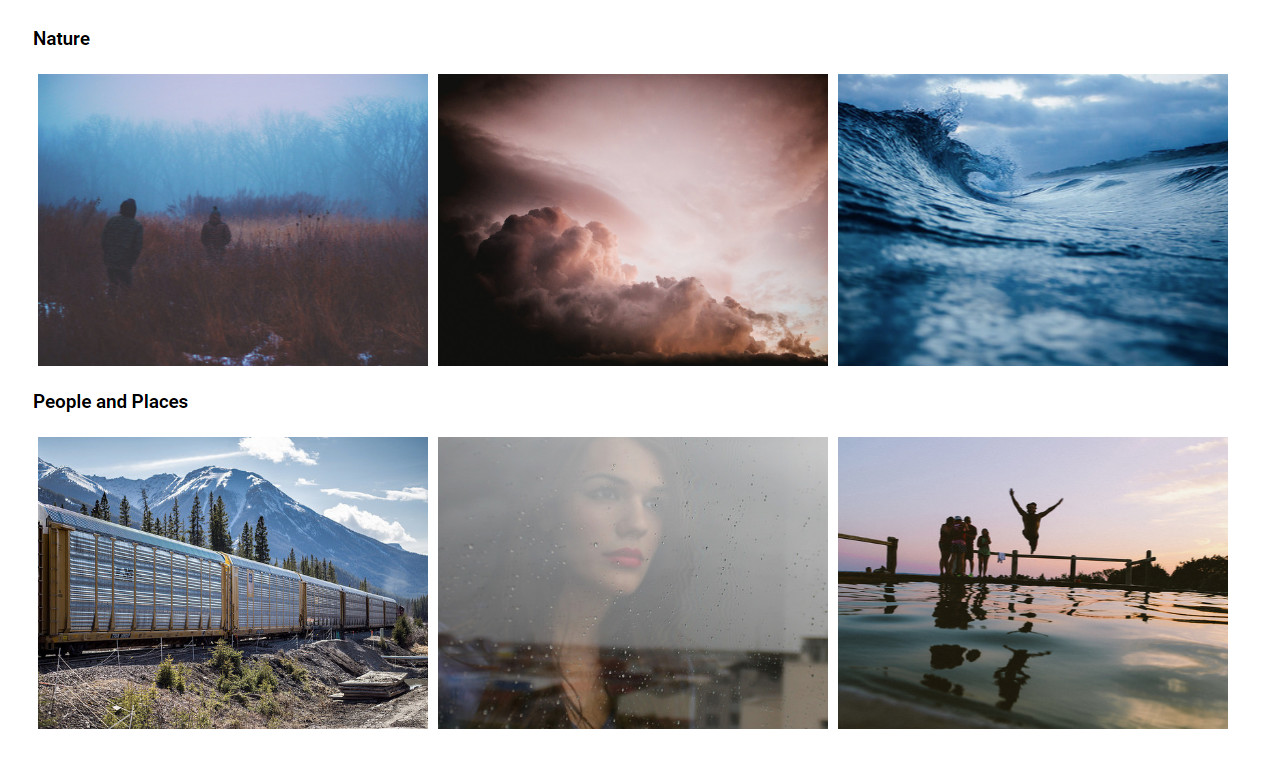
When displaying all or multiple collections on a single page, an option can be used to seperate collections into sections using the data-titles data attribute:
<div id="flickrgal" data-collections='["My Collection", "Another Collection"]' data-titles data-apikey='yourApiKey' data-userid='yourUserId'></div>If you're using the included sass in your project, various aspects of the flickrGal layout and style are easy to configure. Important ones are at the top of flickrgal.scss
Colours can be set using the following variables:
// Colours
$colours: (
	primary-accent: #0076E3, // Main gallery accent colour
	secondary-accent: #ff1981,
	lightbox: #000B10
);Behavior and properties of images in the grid can be modified using the image-grid map:
// Image Variables
$image-grid: (
	aspect:  4/3, // Set image aspect ratio e.g. 4/3 == 4:3
	padding: 5px, // Space between images
	default-cols: 3 // Default number of columns
);Gallery breakpoints can be added, removed, and modified using the breakpoints map:
// Gallery Breakpoints (max-width, columns)
$breakpoints: (
	(750px, 2),
	(450px, 1)
);