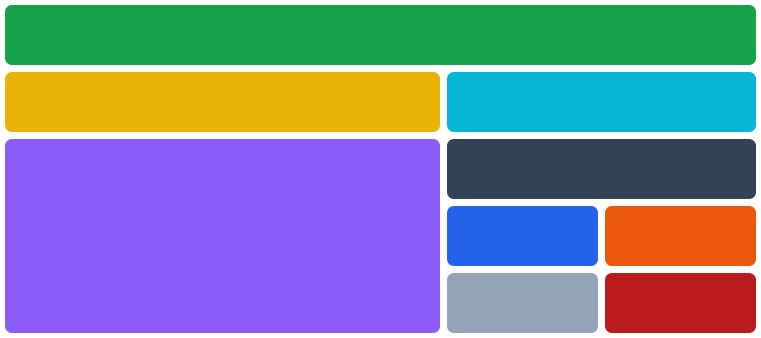
Angular Grid System
Angular library to create a simple grid layout
npm i @marxlnfcs/ngx-grid
Import NgxGridModule from @marxlnfcs/ngx-grid
import { NgxGridModule } from '@marxlnfcs/ngx-grid-alt';

@NgModule({
  imports: [
    NgxGridModule.forRoot({ ... })
  ]
})Simple component to build a dynamic and easy to use grid layout
<ngx-grid>
  <ngx-grid-column>...</ngx-grid-column>
  <ngx-grid-column>...</ngx-grid-column>
  <ngx-grid-group>
    <ngx-grid-column>...</ngx-grid-column>
    <ngx-grid-column>...</ngx-grid-column>
  </ngx-grid-group>
</ngx-grid>strategy- Defines the strategy of the grid component. SCREEN uses the media queries and CONTAINER uses the container queries which is experimental, Possible values: screen, containerbaseBreakpoint- Defines the base breakpoint of this component. (default isxs), Possible values: xs, sm, md, lg, xl, 2xl, 3xl, 4xlbaseSize- Defines the default column size of the grid. (default is12), Possible values: 2, 4, 6, 8, 10, 12gap- Sets the spacing between all columns and rows. (default is1rem)columnGap- Sets the spacing between all columns. (default is the value of thegapoption)rowGap- Sets the spacing between all rows. (default is the value of thegapoption)autoRows- Whether to use the grid-auto-rows feature. (default isfalse)rows- Accepts a list of strings to define the size of each row statically. (default isnull)
For every directive there are multiple size, offset and order options for each breakpoint.
The [size], [offset] and [order] input uses the current base breakpoint.
Breakpoints: xs, sm, md, lg, xl, 2xl, 3xl and 4xl
Sizes: 1-12
Offset sizes: 2, 4, 6, 8, 10
size- Sets the width (1-12) of the column. (default is12)*:size- Sets the width (1-12) of the column. (default is12)offset- Sets the distance from the left. (default isnull)*:offset- Sets the distance from the left. (default isnull)order- Sets the position of the column. (default isnull)*:order- Sets the position of the column. (default isnull)
For every directive there are multiple size, offset and order options for each breakpoint.
The [size], [offset] and [order] input uses the current base breakpoint.
Breakpoints: xs, sm, md, lg, xl, 2xl, 3xl and 4xl
Sizes: 1-12
Offset sizes: 2, 4, 6, 8, 10
gap- Sets the spacing between all columns and rows. (default is1rem)columnGap- Sets the spacing between all columns. (default is the value of thegapoption)rowGap- Sets the spacing between all rows. (default is the value of thegapoption)autoRows- Whether to use the grid-auto-rows feature. (default istrue)rows- Accepts a list of strings to define the size of each row statically. (default isnull)size- Sets the width (1-12) of the column. (default is12)*:size- Sets the width (1-12) of the column. (default is12)offset- Sets the distance from the left. (default isnull)*:offset- Sets the distance from the left. (default isnull)order- Sets the position of the column. (default isnull)*:order- Sets the position of the column. (default isnull)
Simple component to center a specific size of container
<ngx-grid-centered>
  ...
</ngx-grid-centered>For every breakpoint, there is a native size option.
The [size] input uses the current base breakpoint.
Breakpoints: xs, sm, md, lg, xl, 2xl, 3xl and 4xl
Sizes: 1-12
size- Sets the width (1-12) of the column. (default is12)*:size- Sets the width (1-12) of the column. (default is12)autoRows- Whether to use the grid-auto-rows feature. (default isfalse)
Structural directive to add/remove an element if the defined breakpoint fits.
<div *ngxScreenSize"'xs'">
...
</div>Directive to add classes and/or styles based on the breakpoint
<div
  [xs.class]="'class1, class2'"
  [xs.class]="['class1', 'class2']"
  [xs.class]="{ class1: true, class2: true }"

  [xs.style]="'display: none; color: black;'"
  [xs.style]="['display: none', 'color: black; background-color: green;']"
  [xs.style]="{ 'display': 'none', 'color': 'black' }"
>
  ...
</div>In the forRoot method when importing the grid module in the app module you can specify the following options that will be globally applied to all grid instances.
strategy- Defines the strategy of the grid component. SCREEN uses the media queries and CONTAINER uses the container queries which is still experimental, Possible values: screen, containerbaseBreakpoint- Defines the base breakpoint of this component. (default isxs), Possible values: xs, sm, md, lg, xl, 2xl, 3xl, 4xlbaseSize- Defines the default column size of the grid. (default is12), Possible values: 2, 4, 6, 8, 10, 12gap- Sets the spacing between all columns and rows. (default is1rem)columnGap- Sets the spacing between all columns. (default is the value of thegapoption)rowGap- Sets the spacing between all rows. (default is the value of thegapoption)autoRows- Whether to use the grid-auto-rows feature. (default isfalse)breakpoints- Key-Value object with name of breakpoint as key and minWidth as number


